

Creating a balanced color scheme is essential for making your artwork visually appealing.
The right colors can evoke emotions, set the mood, and enhance the overall impact of your piece.
Understanding how different colors interact with one another sets the foundation for successful artistic expression.
Color theory provides various approaches to achieve harmony in your creations.
Exploring different color schemes, such as complementary or analogous combinations, can help you find the perfect balance that resonates with your artistic vision.
As you experiment with these principles, you’ll discover how to make your art not just seen, but felt.
Complementary Pairs
Using complementary pairs in your art can create striking visual contrasts.
These pairs are found directly opposite each other on the color wheel.
For example, red and green, blue and orange, or yellow and purple.
When you combine these colors, they enhance each other’s vibrancy.
This is especially useful for drawing attention to specific elements in your artwork.
If you choose one color as your focus, the complementary hue can help it stand out.
Experiment with different shades and tints of your chosen colors.
This can add depth and interest without overwhelming the viewer.
Mixing complementary colors can also produce muted tones, giving your palette a more sophisticated look.
2) The 60-30-10 Rule
The 60-30-10 rule is a simple and effective guideline for creating balanced color schemes.
It’s easy to remember and apply to your art projects.
In this approach, you divide your colors into three parts.
Your main color takes up 60% of the space.
This color usually acts as the backdrop and sets the mood for the entire piece.
Next, the secondary color makes up 30%.
This color adds depth and contrast.
It should complement the main color and enhance the overall look.
Finally, the accent color rounds things out at 10%.
This color provides pops of interest and draws the eye to specific areas.
It can be more vibrant or darker, adding a dynamic element to your artwork.
By following the 60-30-10 rule, you can create a harmonious and engaging composition.
It’s all about balance and ensuring each color plays its part without overwhelming the others.
Give it a try in your next project!
Triadic Harmony
Triadic harmony is a fun and dynamic way to use color in your art.
This scheme involves three colors that are evenly spaced on the color wheel.
When you connect them, they create a triangle, which helps achieve balance and visual interest.
Using this approach, you can select a primary color and then easily find two complementary colors.
For example, pick blue as your base.
The other two colors can be red and yellow, bringing a vibrant feel to your piece.
Triadic color schemes work well in various projects, from illustrations to branding.
They create an energetic look that can catch the viewer’s attention.
Just remember to balance these bold choices with neutrals like whites or grays.
This helps prevent the colors from overwhelming the viewer.
When applying triadic colors, consider your lighting and the space you’re working in.
Certain colors can appear differently depending on their surroundings.
Experimenting is key to mastering this technique, and it can lead to some striking results in your artwork.
4) Analogous Scheme
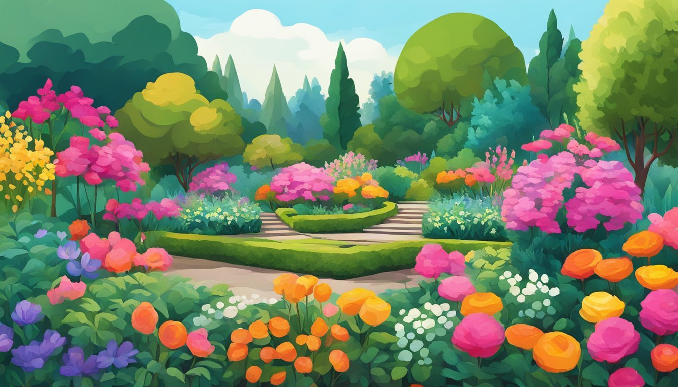
Using an analogous color scheme is a great way to create harmony in your art.
You start by choosing a primary color that will act as the focal point of your piece.
Look at the color wheel and select 2 or 3 adjacent colors that complement your main choice.
For example, if you pick blue, you might add blue-green and green.
This color combination gives your artwork a cohesive look, as analogous colors share a common hue.
They provide enough contrast to keep things lively without overwhelming the viewer.
When applied thoughtfully, colors like red, red-orange, and orange can create a warm and inviting atmosphere.
Experiment with different shades and saturations to find the balance that works best for your vision.
Remember, the key is to maintain harmony while adding visual interest.
Enjoy the process of mixing and matching!
5) Color Temperature

Color temperature is essential for creating a balanced color scheme in your art.
It describes how warm or cool a color appears.
Understanding this can enhance your artwork’s depth and mood.
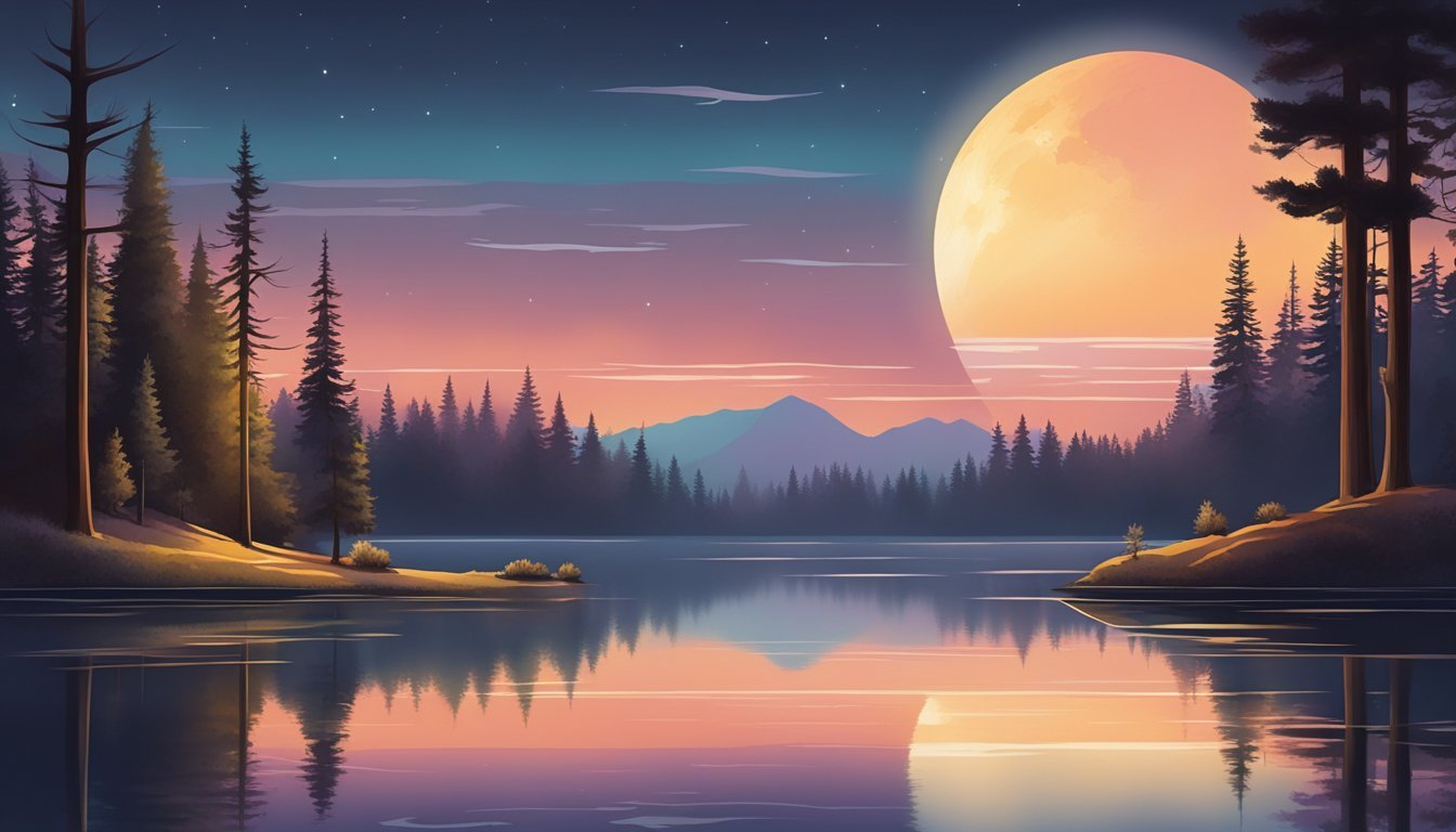
Warm colors, like reds and oranges, tend to evoke energy and vibrancy.
In contrast, cool colors, such as blues and greens, create a calming effect.
Balancing these temperatures can help you achieve harmony in your piece.
Remember that the perceived temperature of a color can change based on its surroundings.
For instance, a blue may seem cooler next to a warm red.
Conversely, a warm yellow can feel brighter in sunlight than in the shade.
When mixing colors, pay attention to their temperature.
Consider how you want your audience to feel.
Utilizing both warm and cool colors can guide the viewer’s eye and create a dynamic composition.
6) Warm vs Cool Contrast
Using warm and cool colors in your art can create striking contrasts that enhance your composition.
Warm colors, like red, orange, and yellow, evoke energy and passion.
They tend to draw attention and can convey excitement in your work.
On the flip side, cool colors such as blue, green, and purple offer a calming effect.
They promote feelings of tranquility and balance.
Combining these two color groups can effectively highlight focal points in your artwork.
For example, if your piece has a predominantly cool background, adding warm accents can bring certain elements to the forefront.
This technique not only adds depth but also creates visual interest.
Experimenting with the ratio of warm to cool colors allows you to influence the mood of your piece.
Too much warmth may feel chaotic, while excessive coolness can appear detached.
Finding the right balance is key.
Monochromatic Palette
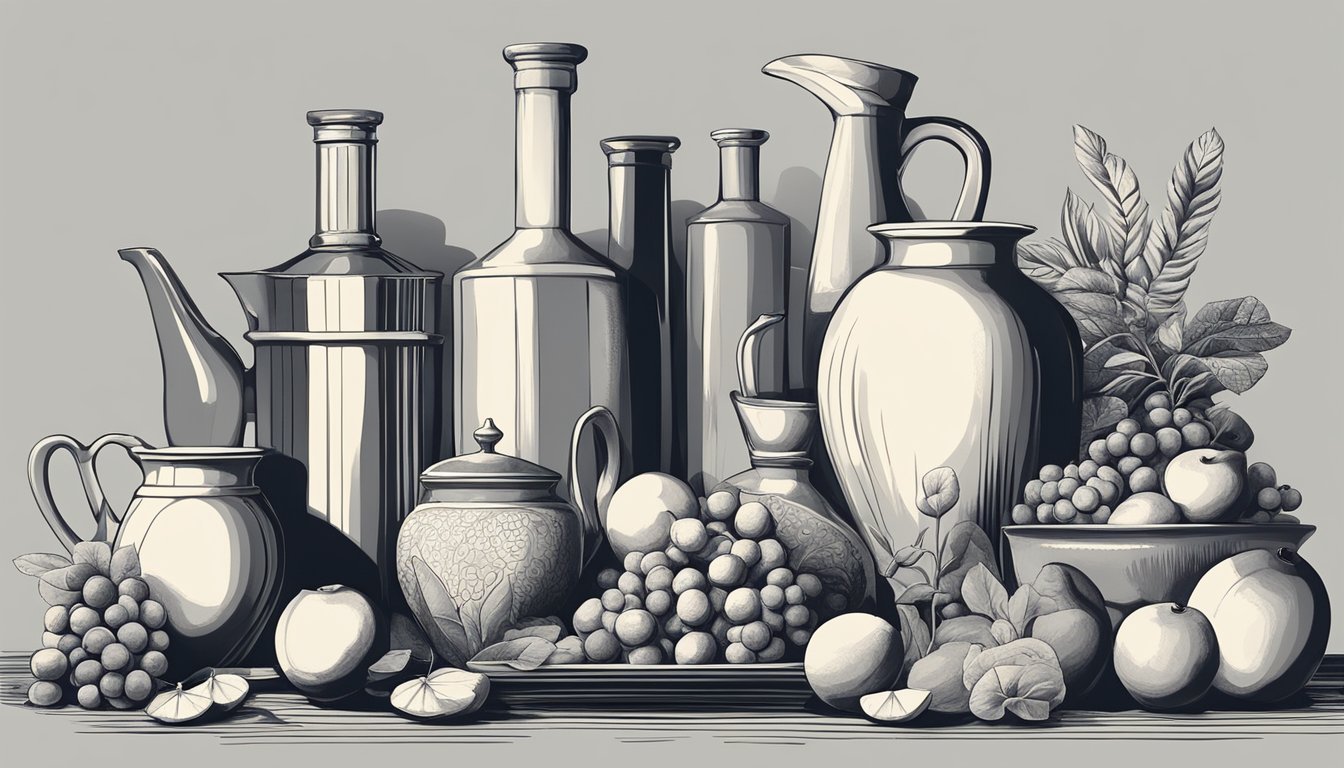
Using a monochromatic palette can simplify your design process.
It involves selecting one base color and using different shades, tints, and tones of that color.
This approach creates a cohesive look since all the variations come from a single hue.
You can experiment with lightening or darkening the base color to find the perfect balance.
Consider the emotional impact of your chosen color.
Different hues can evoke various feelings, so think about what you want to convey.
For instance, blue can bring calmness, while red can evoke energy.
Incorporate texture and pattern to enhance visual interest.
Even with one color family, you can create depth by mixing various tones and textures.
Don’t shy away from playing around with the saturation and brightness of your colors.
This can help achieve the right mood or emphasis in your piece.
A monochromatic scheme is a great way to focus attention where you want it.
By limiting your color choices, you allow other elements of your design to shine.
Contrast with Saturation
When you think about color in your art, saturation plays a big role in creating contrast.
Saturation refers to the intensity of a color.
A color that’s pure and bright has high saturation, while one that’s dull or closer to gray is less saturated.
By using high-saturation colors, you can draw attention to focal points in your artwork.
For instance, a vibrant red against a muted background can really make that red pop.
This technique helps create visual hierarchy in your piece.
On the flip side, using desaturated colors for background elements keeps your overall design balanced.
It allows your eye to focus where it matters most without overwhelming the viewer.
Mixing both saturated and desaturated tones is key.
This way, you maintain excitement while ensuring readability and harmony across your composition.
Try experimenting with different saturation levels in your palette to see what works best for your style.
9) Neutral Base Colours
Neutral colors are a fantastic foundation for your artwork.
They provide balance and allow other colors to shine without overwhelming the viewer.
Using shades like beige, gray, and taupe can create a calming backdrop.
These hues are versatile and work well with a variety of palettes, whether you’re aiming for a minimalistic look or something more vibrant.
You can mix different neutral colors to introduce subtle contrasts.
Experimenting with textures is also a smart way to add depth while keeping your base grounded.
Consider combining warm neutrals like cream with cooler tones such as blue-gray.
This mix can enhance the visual interest in your piece without straying from that balanced feel.
Lastly, don’t shy away from incorporating nature-inspired shades.
Earthy greens or soft browns can enrich your color scheme, creating an inviting atmosphere in your art.
Experiment with Shades
Experimenting with shades is crucial for creating depth in your artwork.
By adding black to a color, you can achieve darker shades that add richness and form.
This technique can help create drama or emphasize specific areas of your piece.
Try mixing shades to see how they interact with your base colors.
You might be surprised at how a darker shade changes the overall mood.
For example, a deep blue can invoke a sense of calm, while a darker red can evoke intensity.
Don’t be afraid to use varying shades within the same color family.
This blend can provide a subtle complexity and enhance cohesion in your design.
Layering these shades effectively can lead to a more engaging composition.
Consider using shades to create contrast as well.
Placing lighter shades next to darker ones can highlight important elements of your work.
This approach draws the viewer’s eye to specific areas, creating a visual pathway.
Keep your experiments playful.
Grab some paint and just see what happens when you mix different brushes and techniques.
Enjoy the process of discovering how shades can elevate your art.
Understanding Color Theory
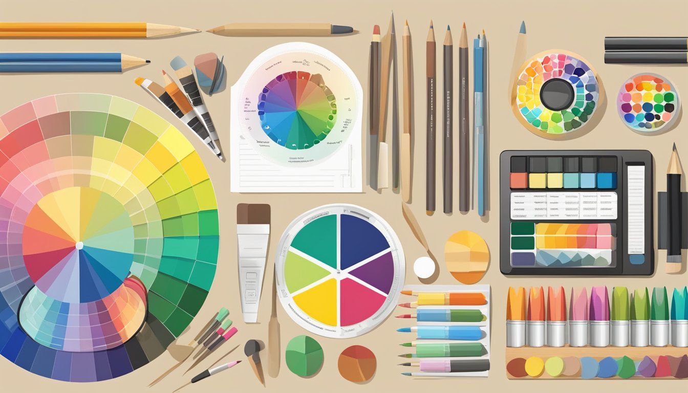
Artists find color theory a fundamental concept.
It helps you make informed choices about color use in your art.
Grasping the relationships between colors can enhance your compositions and create the desired emotional impact.
Primary, Secondary, and Tertiary Colors
Colors are categorized into three main types: primary, secondary, and tertiary.
-
Primary Colors: These are the building blocks of color mixing. You have red, blue, and yellow. You can’t make these colors by mixing others together.
-
Secondary Colors: Created by mixing two primary colors. When you blend red and blue, you get purple; yellow and blue make green; red and yellow produce orange.
-
Tertiary Colors: Mixing a primary color with a neighboring secondary color creates tertiary colors, like red-orange or blue-green.
Knowing these categories allows you to explore various combinations and create dynamic color schemes in your artwork.
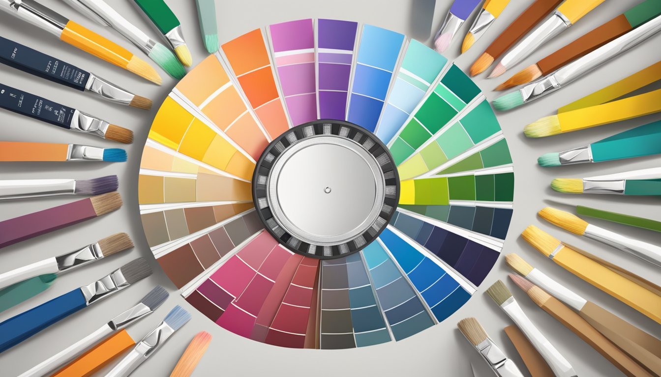
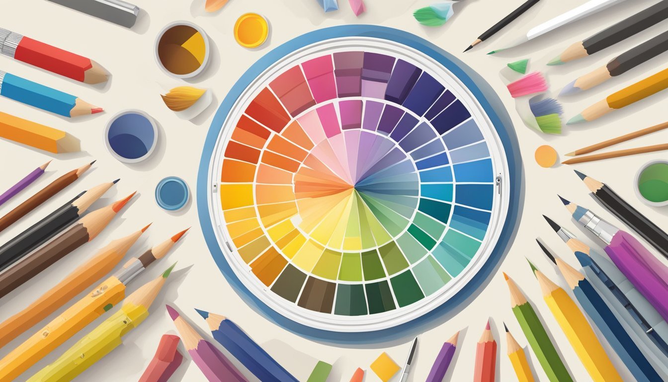
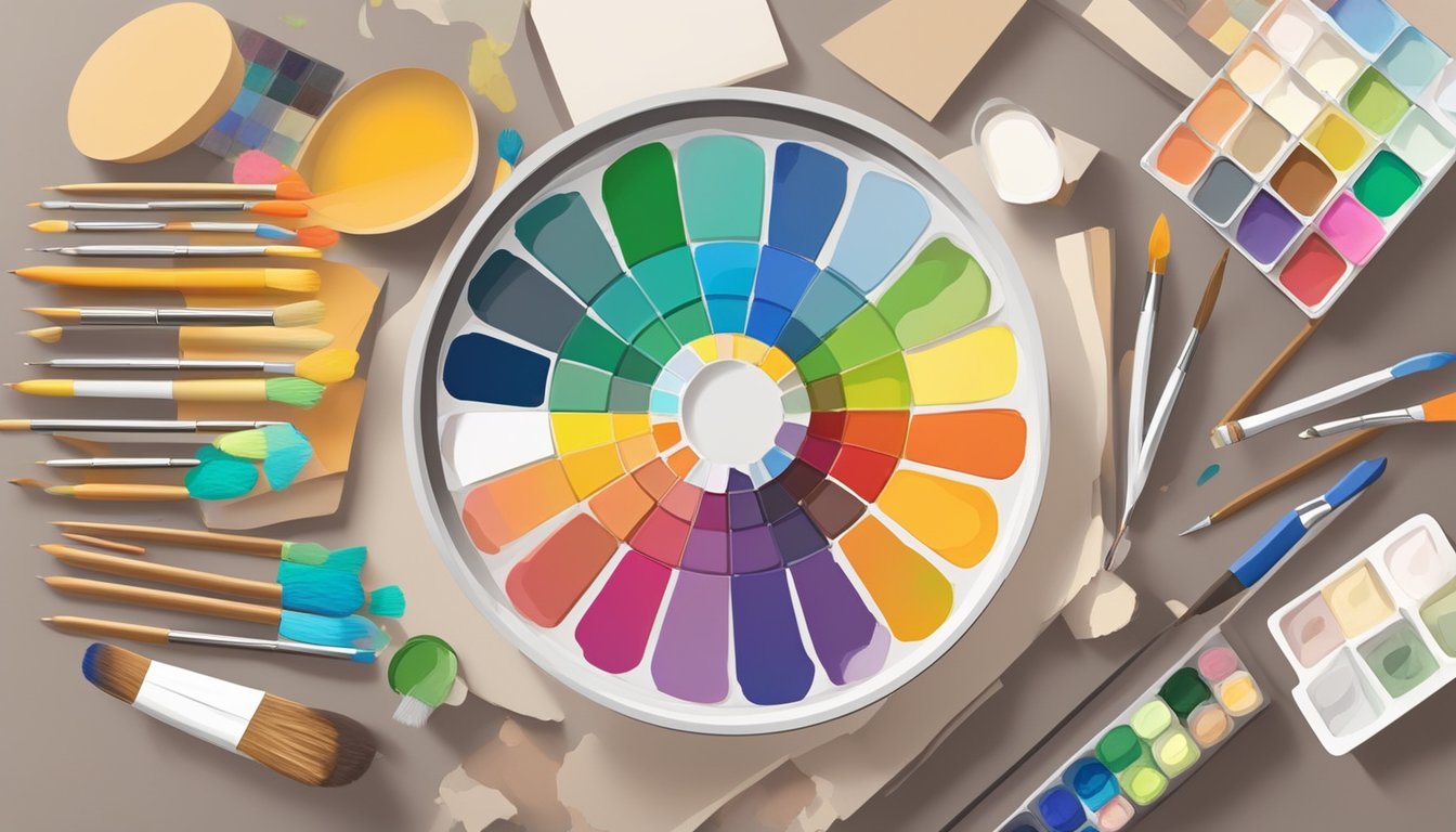
The Color Wheel and Its Importance
The color wheel is a visual representation of colors arranged in a circular format.
It helps you see the relationships between different hues.
-
Complementary Colors: Opposite each other on the wheel, like red and green. Using them together can create contrast and vibrancy.
-
Analogous Colors: Located next to each other, such as yellow, yellow-orange, and orange. These combinations are harmonious and pleasing to the eye.
Understanding how to use the color wheel effectively can aid in creating balanced color schemes.
This ensures you can evoke the right feelings and maintain visual interest in your art.
Techniques for Balancing Colors
Finding the right balance in your color schemes can elevate your artwork dramatically.
Two key methods to create harmony are using complementary colors and following the 60-30-10 rule.
Using Complementary Colors
Complementary colors are located opposite each other on the color wheel.
When used together, they create a striking contrast that draws attention.
For example, pairing blue with orange or red with green can make elements pop in your artwork.
To effectively use complementary colors, start by choosing one dominant color for your piece.
Then, select its complementary shade as an accent.
This combination can add depth while maintaining a vibrant and energetic feel.
Always be mindful of the balance; too much contrast can overwhelm the viewer.
Aim for a harmonious blend that visually excites without clashing.
The 60-30-10 Rule
The 60-30-10 rule is a valuable guideline for color distribution in your artwork.
This technique suggests that you should use 60% of your dominant color, 30% of a secondary color, and 10% of an accent color.
This balanced approach ensures your piece feels cohesive and thoughtfully designed.
For example, if you’re creating a landscape, you might use a soft green for the majority, some warm yellow for highlights, and a vibrant red for flowers or other small elements.
This division helps to guide the viewer’s eye throughout the piece.
Experiment with different colors to see how they interact within this structure.
Then, adjust as needed to achieve the desired effect.