
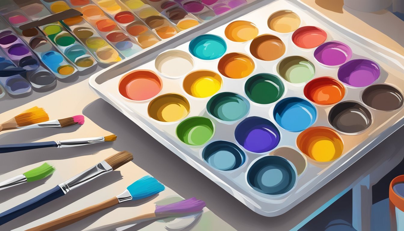
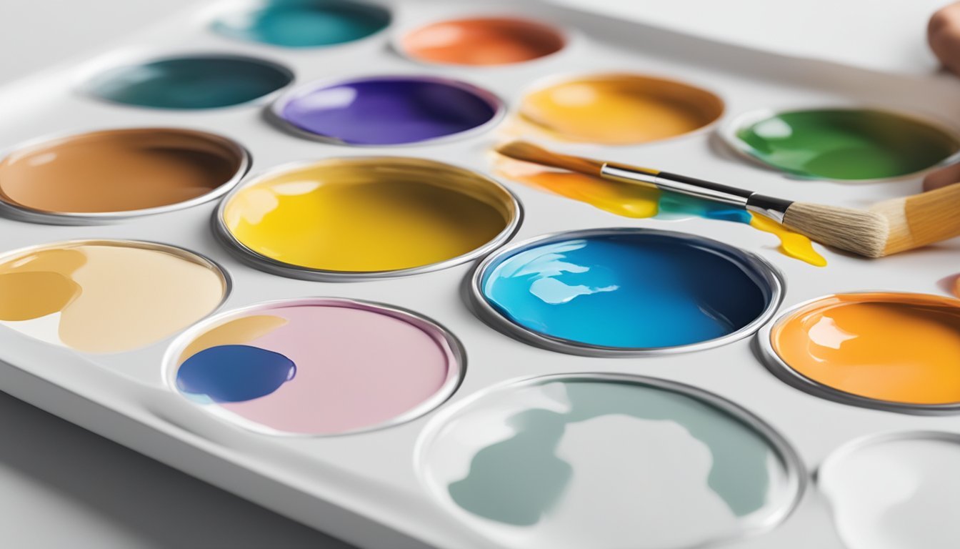
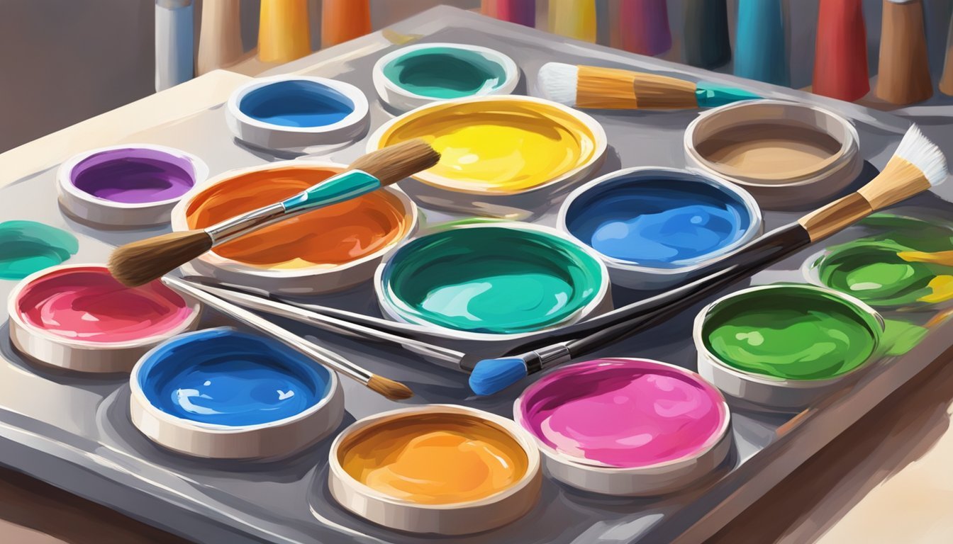
Mixing colors can be one of the most enjoyable aspects of acrylic painting, especially for beginners. Mastering color mixing allows you to create unique shades and tints, enhancing your artistic expression. With a little practice and the right tips, you’ll find that mixing colors can be straightforward and fun.

Whether you’re looking to create realistic skin tones or vibrant landscapes, mastering the basics will set you up for success.
From understanding primary colors to experimenting with various mixing techniques, these tips will guide you on your creative journey in acrylic painting.
1) Start with Primary Colors
Starting with primary colors is essential for any beginner.
These colors—red, blue, and yellow—are the foundation of color mixing.
Using just these three colors, you can create a wide range of hues.
Mixing them in different combinations leads to secondary colors like green, orange, and purple.
It’s helpful to get comfortable with how these colors interact.
For example, mixing blue and yellow gives you green, while red and blue create purple.
Experimenting with primary colors allows you to learn about color relationships.
You’ll see how adding more of one color can shift the result dramatically.
To make your painting process smooth, keep your primary colors close at hand.
They’ll serve as the base for every other color you create.
Enjoy the journey of mixing and discovering new shades!
Mix Complementary Colors
Mixing complementary colors can enhance your artwork by adding depth and richness.
Complementary colors are opposite each other on the color wheel, like blue and orange or red and green.
When you mix these colors, they can neutralize each other, creating interesting grays and muted tones.
This technique helps you avoid overly bright or saturated colors, making your work look more polished.
Start by mixing small amounts to see how the colors interact.
You’ll find that adjusting the proportions can lead to various shades and tones, giving you a lot of flexibility.
Using complements can also create shadows and highlights effectively.
For instance, adding a bit of complementary color to a highlight can make it pop without overwhelming the piece.
Don’t be afraid to experiment with different combinations.
This method opens up a world of color possibilities that can elevate your paintings.
It’s all about finding the right balance that works for your artistic vision.
3) Experiment with Color Value
Color value refers to how light or dark a color appears.
It’s essential to understand this concept for creating depth in your artwork.
By adjusting the value, you can make a color appear more dynamic.
Start by adding white to lighten your colors.
This creates tints that can give your piece a softer look.
Lightening colors helps to highlight areas and suggest light effects.
Conversely, adding a small amount of black will darken your colors, creating shades.
This can add drama and contrast.
Be cautious with black; it can easily overwhelm the color.
You can also try mixing complementary colors to lower their value without changing the hue too much.
This technique often leads to muted and interesting colors.
Try out various combinations on a test palette.
Track your results and note how each change affects the overall painting.
This experimentation helps you develop a more intuitive sense of color mixing.
Remember, there are no strict rules, so let your creativity guide you.
4) Use a Color Wheel
A color wheel is a great tool for you to mix acrylic paints effectively.
It visually represents colors and their relationships, making it easier to understand how they interact.
Start with the primary colors: red, blue, and yellow.
These are the foundation for creating all other colors.
Mixing them together forms secondary colors like green, orange, and purple.
You can also use the color wheel to explore complementary colors.
These are colors located opposite each other on the wheel, such as blue and orange.
Pairing complementary colors enhances contrast and vibrancy in your artwork.
Additionally, the color wheel helps you identify warm and cool colors.
Warm colors, like reds and yellows, create a sense of energy, while cool colors, such as blues and greens, add calmness.
Mixing these can create various effects in your paintings.
Using a color wheel is a straightforward way to develop your color-mixing skills.
As you become familiar with it, you’ll gain confidence in your acrylic painting journey.
5) Explore Tints and Shades
Experimenting with tints and shades can really elevate your acrylic painting.
Tints are created by adding white to your base color.
This softens the original hue and introduces lighter variations.
To create shades, you’ll add black or a darker color.
This darkens the base tone, providing depth and contrast.
Just remember, using black can sometimes overpower your colors, so adjust slowly.
Consider mixing a color chart with different tints and shades.
This practice helps you visualize how colors change.
You can keep it handy for future reference as you paint.
Using tints and shades not only enriches your palette but also adds dimension to your work.
You’ll find that it gives a sense of light and shadow, making your artwork come alive.
Enjoy the process of discovering unique combinations that work for you.
Understanding Color Theory
Color theory is essential for creating appealing artworks.
It involves how colors interact with one another, and understanding this will help you mix paints more effectively.
Primary, Secondary, and Tertiary Colors
Primary colors are the foundation of all other colors.
In the context of acrylic painting, the primary colors are red, blue, and yellow.
You can’t create these colors by mixing others.
When you mix two primary colors, you get secondary colors:
- Red + Blue = Purple
- Blue + Yellow = Green
- Yellow + Red = Orange
Tertiary colors come from mixing a primary color with a secondary color.
Examples include:
- Red-Orange
- Yellow-Green
- Blue-Violet
Understanding these categories helps you predict the colors you can create.
Color Wheel Basics
The color wheel is a visual representation of colors arranged in a circle.
It includes primary, secondary, and tertiary colors, showing how they relate to one another.
Colors opposite each other are called complementary colors.
When mixed, they create neutral tones.
For example, red and green are complementary; mixing them results in a brown hue.
Analogous colors are next to each other on the wheel.
They work well together and create harmonious combinations.
For instance, blue, blue-green, and green look great in artwork.
Using the color wheel as a guide can significantly enhance your color mixing skills.
Choosing the Right Acrylic Paints
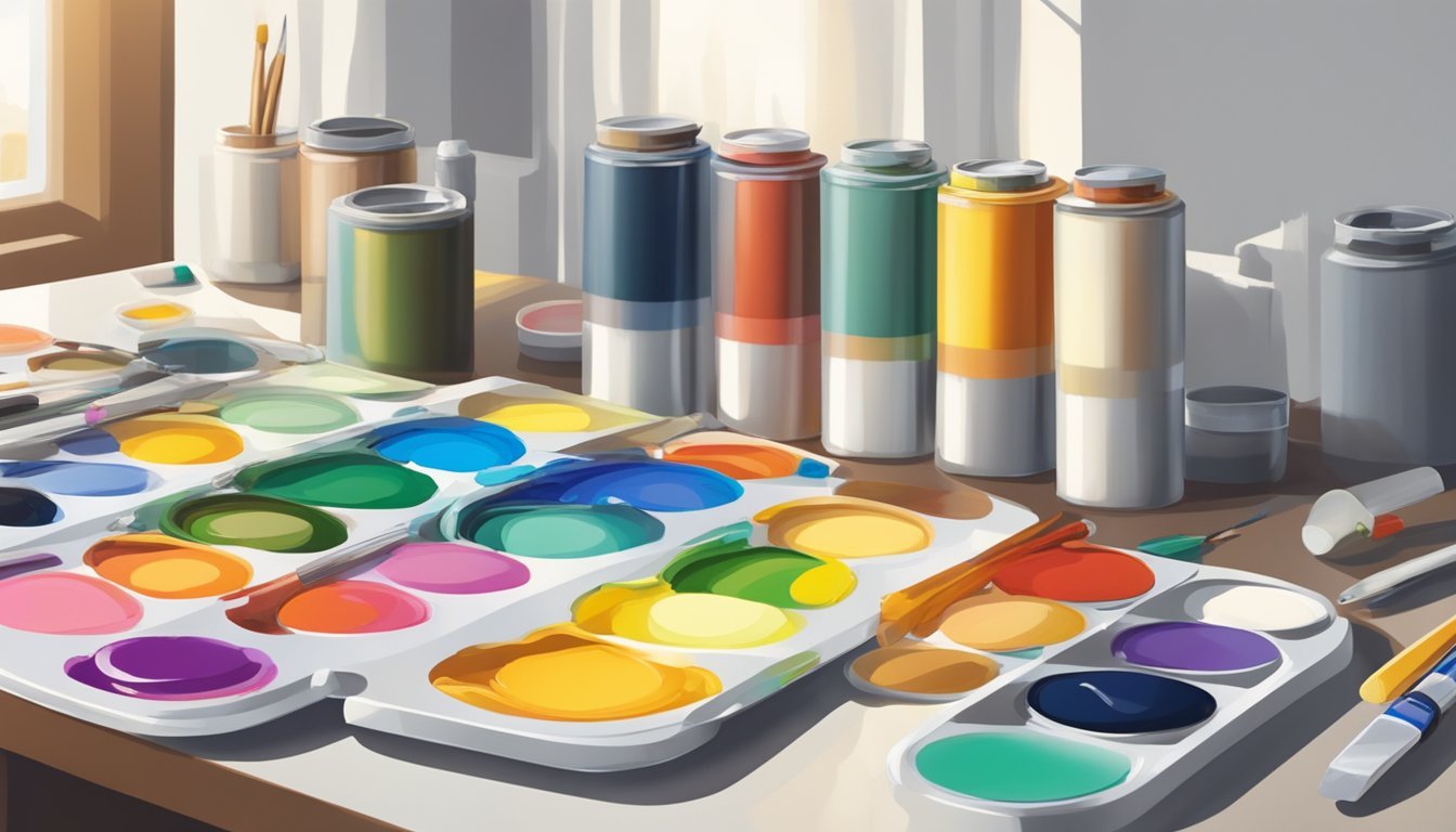
Selecting the right acrylic paints is crucial for achieving the best results in your artwork.
You want paints that balance quality and affordability, especially as a beginner.
Here are some key points to consider.
Quality vs. Price
When starting out, it’s tempting to go for the cheapest option.
However, the quality of your acrylic paint can significantly impact your painting experience.
Higher-quality paints often have better pigmentation, smoother application, and greater durability.
Look for paints labeled as “student grade” if you’re on a budget.
These offer a decent quality at a lower price point.
On the flip side, “artist grade” paints provide richer color and more lightfastness, ensuring your work maintains its vibrancy over time.
This might be worth the investment if you plan to sell or display your art.
Recommended Brands for Beginners
Here are some brands that highly recommend for beginners:
- Liquitex Basics: This brand is affordable and offers a good variety of colors. It’s great for practice.
- Golden Heavy Body: This brand offers professional quality but can be pricier. It also has excellent texture and coverage.
- Amsterdam Standard Series: This brand is a mid-range option with vibrant colors and smooth consistency.
You can find starter sets from these brands.
These sets give you a chance to try multiple colors without breaking the bank.
Look for sets that include primary colors and white.
This will help you experiment with mixing.
Choose the brand that feels right for you and enjoy the journey of acrylic painting!